peri
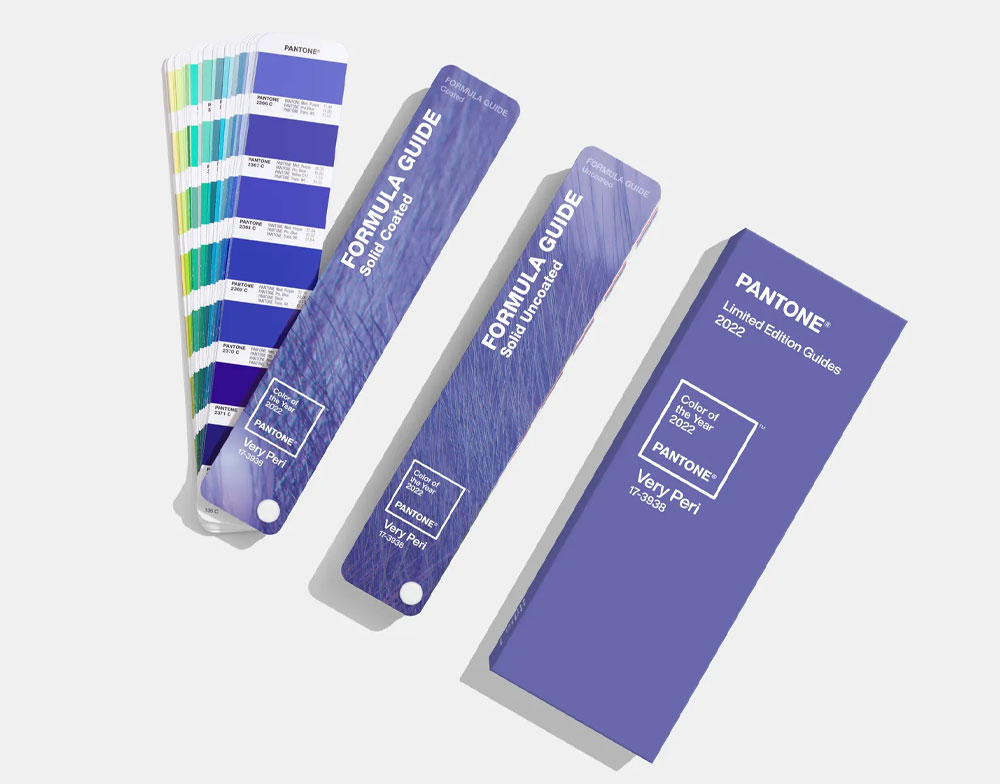
Pantone bets on their own distinct shade of periwinkle. Photo: Courtesy of Pantone
Very Peri by Pantone
Industry leader Pantone announced its color of the year for 2022 in early December. The selection is a perfectly purple blue shade of periwinkle. “For those who are gun-shy about using too much color and taking that first step, it’s a great color to use maybe just on one wall instead of all four walls,” says Leatrice Eiseman, executive director of the Pantone Color Institute, and it’s decidedly different from any pale or olive green.
What does periwinkle color mean?
With subtle shades of purple and pink, periwinkle soothes as it signals softness. Many artists and designers use periwinkle to invoke notions of:
- Femininity
- Romance
- Peacefulness
- Elegance
- Trustworthiness
Claude Monet’s The Garden at Giverny (La maison à travers les roses) is a perfect example of periwinkle’s emotional magic. Learn more about color meaning to inform your next work of art.
How to pair periwinkle.
You can reach for periwinkle to anchor the vibrancy of colors like green and orange. For example, if your pop art design or floral painting has clashing green and orange hues, you can introduce periwinkle to balance the palette’s energy.
Plus, if you’re working with a palette that leans neutral or blue, periwinkle is a perfect complement. Play with periwinkle’s saturation and lightness to hone your design’s palette and message. You can also work with related hues like:
ROSE QUARTZ
- HEX: #F7CAC9
- RGB: 247, 202, 201
PASTEL PURPLE
- HEX: #B39EB5
- RGB: 179, 158, 181
LILAC
- HEX: #C8A2C8
- RGB: 200, 162, 200
Bolster your creative expression with the color periwinkle and its emotional influence. Explore what more you can do with by contacting us today!
Let’s Work Together
Tell us more about your project
Expert Advice
Trending Design News


